

PlayPal
Gamified Financial Literacy for Kids
My UX Design team was placed in a startup incubator and prompted to identify an opportunity by sub-branding with a company that could stand on its own but would better meet its potential as a member of an existing family of products. The outcome was a partnership with PayPal to promote financial literacy for kids. Let's take a look at how we got there...
Role
UX Designer & Researcher
Team
2 Designers/Researchers, 1 Project Manager
Timeline
Tools
2 weeks
Figma, Zeplin, Photoshop
FINAL SCREENS


SCOPE
Let's Talk About the Project
Our project delves into the realm of financial education for children. We started with the hypothesis that both schools and parents encounter obstacles in teaching money management for children, while children may not always show a natural inclination to learn these skills.
VALUE PROPOSITION

Lack of financial literacy resources for children

Opportunity to accelerate financial literacy
Set up kids for financial success
TARGET AUDIENCE


Parents of Children ages 6-9
Children ages 6-9
UX Process
These are the key processes we followed through research, design, and testing to inform our final MVP.

Why we chose to partner with PayPal
We chose to partner with PayPal because they embody a safe and secure financial environment catering to an audience of both adults and children. Below is a Venn Diagram which outlines our reasoning.

-
Secure and trustworthy
-
Purchase Protection
-
Send money
Safety
Users across generations
In-app purchases
-
Gamified education
-
Parental Involvement
-
Investment in kids + families


So we asked ourselves...
How might we provide parents with accessible and age-appropriate financial education resources for their children's development? We turned to a series of research methods to glean insights on our target users.
USER RESEARCH
Getting to know our Users
We interviewed 3 children aged 6-9 and 5 parents with children aged 6-9 to gain a comprehensive understanding of the parent-child relationship regarding financial literacy. This approach aimed to uncover insights into their perspectives, needs, and challenges, informing our design decisions.
RESEARCH GOALS

Discover how children are currently learning about finances

Explore opportunities for growth in children's financial literacy

Learn parents' pain points of educating children
USER INTERVIEWS
5 users:


Parents of Children ages 6-9
Children ages 6-9
Affinity Mapping
We scripted a discussion guide and compiled notes during interviews. These notes were then written on post-its and mapped together into logical groups.

FINDINGS FROM USER INTERVIEWS
The insights we gained from user interviews set the stage for the core features that were later implemented into our MVP. These insights would be implemented as the first set of features that would add significant improvement to the overall product:

Parents aim to teach financial concepts to their kids but lack resources

Parents aim to oversee children's spending, while children seek more autonomy

Kids learn best through games and interactive activities

Parents allow non-essential spending when the needs vs. wants difference is clear
Once we pulled insights from user interviews, we decided to create a persona of our user and outline a day in their life via journey map.
DEFINING THE USER
Putting a face to our user
Meet Anna and Ivan
We found it important to put a face to our user research insights in order to build empathy and assimilate with the target audience's goals, needs, and frustrations.

-
Offers financial guidance to her child
-
Provides allowance & oversees spending
-
Actively seeks out learning resources for child
Understands benefits of building good habits early
Desires a safe learning environment
Desire for apps to accomplish goals
-
Trust in parents' recommendations
-
Learns best with interactive games
-
Developing sense of capability and desires more independence
CHILD


PARENT
User Persona of Parent and Child
KEY POINTS

Ivan wants to learn about money, and his mom, Anna, is key to his learning
Anna is frustrated with the lack of financial education for kids and seeks a simple solution for Ivan
Anna wants to monitor Ivan's learning


A day in the life of Anna and Ivan
By utilizing a User Journey Map, we uncovered insights into our user personas' emotional journey and how their decision-making was influenced. Here is a story of Anna and Ivan's trip to the toy store which outlines the importance of financial literacy in kids' day-to-day interactions. This helped us find opportunities where a potential product would be beneficial.


The day begins with a car ride to the toy store where Anna gives $10 to Ivan for his good behavior
We want to pay attention to the emotional benefit of hands on rewards when learning. Keep this in mind as this will be retained in our product.


At the toy store, Ivan wants to buy everything he sees and is not happy when Anna explains to him that they have to stick to a budget
We think we could help Anna teach Ivan to not impulsively spend, but instead, consciously spend. This brings up the lesson of needs versus wants.


They leave the toy store and Anna hands Ivan PlayPal to learn from his experience in the toy store
This helps Ivan have fun while learning and continue developing a healthy relationship with money.
The act of envisioning how users would benefit from our product gleaned key design ideas. Before jumping into design, we set core product design principles to abide by based on research. Let's take a look at how we decided on product features below.
DESIGN PLANNING
How we decided on design features
Must-Could-Should-Won’t Framework (Mu-Sh-Co-Wo)
Each member of our group wrote down a few features on post-its that could potentially be included in our MVP design. We then utilized a Mu-Sh-Co-Wo framework to rank these features by deciding if a feature Must, Could, Should, or Won’t be included in our MVP.

Mu-Sh-Co-Wo Map
MOST IMPORTANT FEATURES

Orientation to platform

Fun Visuals

Parent Involvement

Rewards
Educational Games


Avatar Customization

Story Mode
Feature Prioritization Matrix
Once we decided on the most important features using a Mu-Sh-Co-Wo Framework, we compiled those features onto a Feature Prioritization Matrix. Here, we ordered features based on amount of effort required and level of priority.
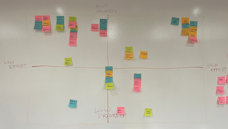
Feature Prioritization Matrix
FEATURES TO BE INCLUDED IN MVP

Create an Account

Wallet/Savings

Parent Involvement

Avatar Customization

Kid Friendly Interface
Progress Tracking


Levels

Story Mode
The Mu-Sh-Co-Wo Framework helped us measure the importance of features, while the Feature Prioritization Matrix assisted in deciding what features were most realistic to be included in our MVP.
DESIGN PLANNING
Setting the ground rules for our design
Just before sketching our design, we set product principles to abide by to ensure that product values, elements, and color schemes were kept consistent with user research.
Product Principles


Clarity

Progressing Game Status


Self Paced


Engaging Education


Encouraging
Style Guide
When it came to hi-fidelity prototyping, we decided on a Style Guide that we found would cater to the spirited energy of our target audience, 6-9-year-olds. Our style guide was informed by our product principles, as well as taking inspiration from popular children's apps.

Product principles formed the very foundation of our brand and helped guide us as we designed and developed PlayPal Kids.
DESIGN
Getting to work on our design
Low-Fidelity Mid-Fidelity Wireframes
My team enthusiastically jumped into design, hence our mid-fi wireframes looking so mature. Our team each sketched a potential user flow of the PlayPal platform with regards to the core that surfaced in our Mu-Sh-Co-Wo Framework and Feature Prioritization Matrix. Here are how some of our sketches were directly translated into our mid-fidelity wireframes.


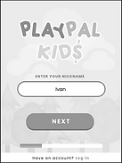


Avatar Customization

Levels

Orientation to platform
Educational Games


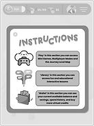


Wallet/Savings
Kid Friendly Interface
Story Mode
Create an Account
TESTING
Testing our screens
We tested children and parents separately, and had a child-specific user flow, and parent-specific user flow. We conducted 5 tests with kids, and 5 tests with parents.
5


Parents of Children ages 6-9
Children ages 6-9
5
2 Rounds of testing:
TASK
1. Create a profile
2. Begin story mode
TASK
1. Open the menu and check your child's progress
Round 1
TESTING
Child Testing Round 1
Conducting and receiving feedback with children was a riot, as you could imagine. Overall testing was a success. The key spaces for improvement was aligning terminology to kid-friendly language, ensuring call-to-action elements were large enough to grab a child's attention, and confirming all UI design was kept consistent.
TASK CREATE A PROFILE

Log In/Sign Up
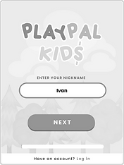
Onboarding (Nickname)

Onboarding (Grade)

Onboarding (Age)

Avatar Selection
Instructions
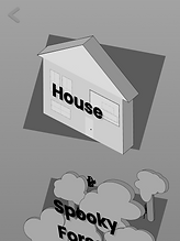
TASK BEGIN STORY MODE


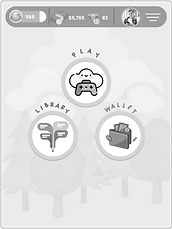
Dashboard
Game Dashboard
Journey Map


Home Overview
Home Entrance
Parents Testing Round 1
Although user testing on parents ran smoothly, we received ample feedback about adding a feature that allowed parents to check their child's progress from the parents' own device. This inspired a parents-only log in on mobile which was implemented for the 2nd Round of testing.
TASK OPEN MENU AND CHECK YOUR CHILD'S PROGRESS

Dashboard
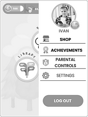
Side Menu
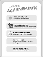
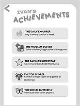
Achievements Overview
With Round 1 testing complete for children and parents, we analyzed our finding and made updates...
Updates made after Round 1 testing
ITERATE
Child Testing Updates
BEFORE
AFTER


SIGN UP / LOG IN SCREEN
Increase size of buttons for call-to-action elements
Users spent more time on tasks than necessary because the correct answer was not made clear
Actions
-
Increased size of SIGN UP button and placed it in a more actionable location
-
Highlighted all buttons across interface that require a call-to-action to steer users in the right direction

BEFORE
AFTER

GAMING SCREEN
Terminology needs to be updated
Users had trouble deciphering the language used for certain navigational elements
Actions
-
Changed GAME ZONE to MINI GAMES

BEFORE
AFTER
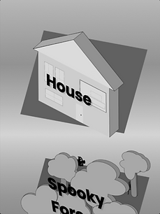
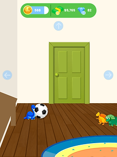
JOURNEY MAP SCREEN
UI must remain consistent
Users were confused as the visuals of screens switched when accessing "Journey" mode
Actions
-
We re-evaluated the style of the medium-fidelity design to match it to the rest of the interface
AFTER

BEFORE
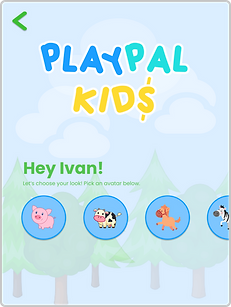
JOURNEY MAP VIRTUAL ROOM SCREEN
Prototyping needs updating
Prototype was originally "On Drag", but users expected it to be "On Click" when navigating the virtual room
Actions
-
We changed the action to move around the room from a drag to a click

AFTER
BEFORE
ORIENTATION SCREEN
Removed progress bar from sign up process
Users thought the progress bar it was a timer
Actions
-
Removed progress bar
Parents Screen Updates
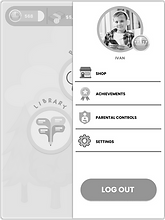
Parents can now access their child's progress through the child's log-in, and their own mobile log-in.
VIA CHILD 'S ACCOUNT (TABLET)


VIA PARENT ACCOUNT (MOBILE)


Made parent access log-in available from child view and parent mobile app
Parents wanted to be able to access their child's account progress from their child's device and their own
Actions
-
Added a mobile version and separate log-in for parents
OPEN MENU AND CHECK CHILD'S PROGRESS
TESTING RESULTS
How our updates performed
Over 2 Rounds of Testing, we conducted 20 testing sessions, 10 with children, 10 with parents. Here are the results.
Children Results


CREATE A PROFILE
-
Increased user task success by 10% by making call-to-action elements larger
-
Time to complete task increased by 5 seconds, which turned out to be acceptable, as the success rate concurrently increased by 10%



BEGIN STORY MODE
-
Increased user task success by 20% by improving design consistency
-
Time to complete task decreased by 2 seconds through design consistency and adding the title "JOURNEY MAP"
Parent Results






-
27% decrease in time taken
-
Even though our Round 2 design included more screens, time taken to complete task actually decreased
-
-
Easiness rating decreased by 12%
-
May have been caused by parents misunderstanding that they can access account from their own log in
-
To improve this, we will allow functionality on the child’s app and on parents mobile app
-
OPEN MENU AND CHECK CHILD'S PROGRESS
USER FLOWS/WIREFRAMES
Hi-Fi User Flows
After the updates made in Round 1 and 2 of Testing, here are the final user flows.
Child Screens
CREATE A PROFILE

BEGIN STORY MODE


Parent Screens
OPEN MENU AND CHECK YOUR CHILD'S PROGRESS
VIA CHILD 'S ACCOUNT (TABLET)

Child's Progress Tablet View
OPEN MENU AND CHECK YOUR CHILD'S PROGRESS
VIA PARENT ACCOUNT (MOBILE)

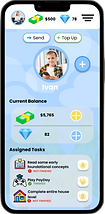
Parent-Only Mobile View
With our hi-fi wireframes optimized through testing, we then took steps to connect each user flow into one big flow, known as an App Map.
App Map
Once our screen flows were fleshed out we were able to create an App Map of all possible user flows in PlayPal. You can think of this as a sitemap that visualizes the steps taken to navigate our app. This helped us consider further recommendations for additions to the app down the road.

Click to view
With all of our user flows and prototype in order, we then planned for next steps.
NEXT STEPS
Recommendations for the future
Feature Expansion
Expanding the scope of our project involves more usability testing, API integration for seamless log in and payment, and most importantly, connecting with game creators to add educational gaming content to the platform. We created a game called PayDay as inspiration for future additions. Check it out!

PAYDAY MINI GAME
DISTRIBUTE MONEY IN PAYDAY MINI GAME

KEY RECOMMENDATIONS
Incorporate more features and testing
Launch a beta version, followed by a gradual expansion to accommodate more users
Retain bond with users by introducing streak-based achievements
LEARNINGS
Shoulda coulda woulda

Learnings
Deliver unbiased user interviews by keeping target audience cohorts separated
Give mid-fi design more time as our mid-fi design was very mature
Utilizing a group sync framework to discuss work styles, roles, goals and motivations is key to producing a winning team

Next time
Ensure discussion guides are tailored to all audiences involved
Set product principles, color schemes, and feature prioritization prior to design
Differentiate between designers, researchers, and program manager, and agree on a way to keep track of work
PROTOTYPE
Bringing the experience to life


